The brief was to design an interactive touchscreen introducing Earth Insights. The project was presented at HP Discover Barcelona, an industry conference which was attended by approximately 10,000 customers, partners and IT thought leaders.
As we received the data at the same time as the CI’s scientific team, there were no pre-analyzed findings to highlight. Instead, we rolled up our sleeves and dug right into the raw numbers. Sébastien, Lead Developer and company founder, built prototype visualizations that revealed interesting leads and helped to inspire our concept.
Meanwhile, Audrée, Creative Director and co-founder, and I reworked the charts with a graphical language that was coherent with the global design approach. The experience was structured to guide the user from a big picture overview to granular data insights. To this end, I developed three environments that could tell different parts of the story. Each of these environment housed different key findings pertinent to the project’s goal to demonstrate biodiversity loss.
Objectives
ENVIRONMENT 1
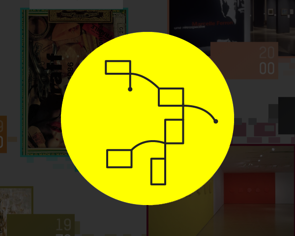
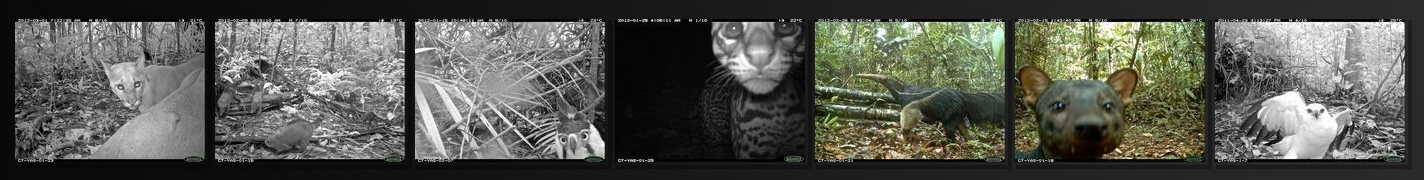
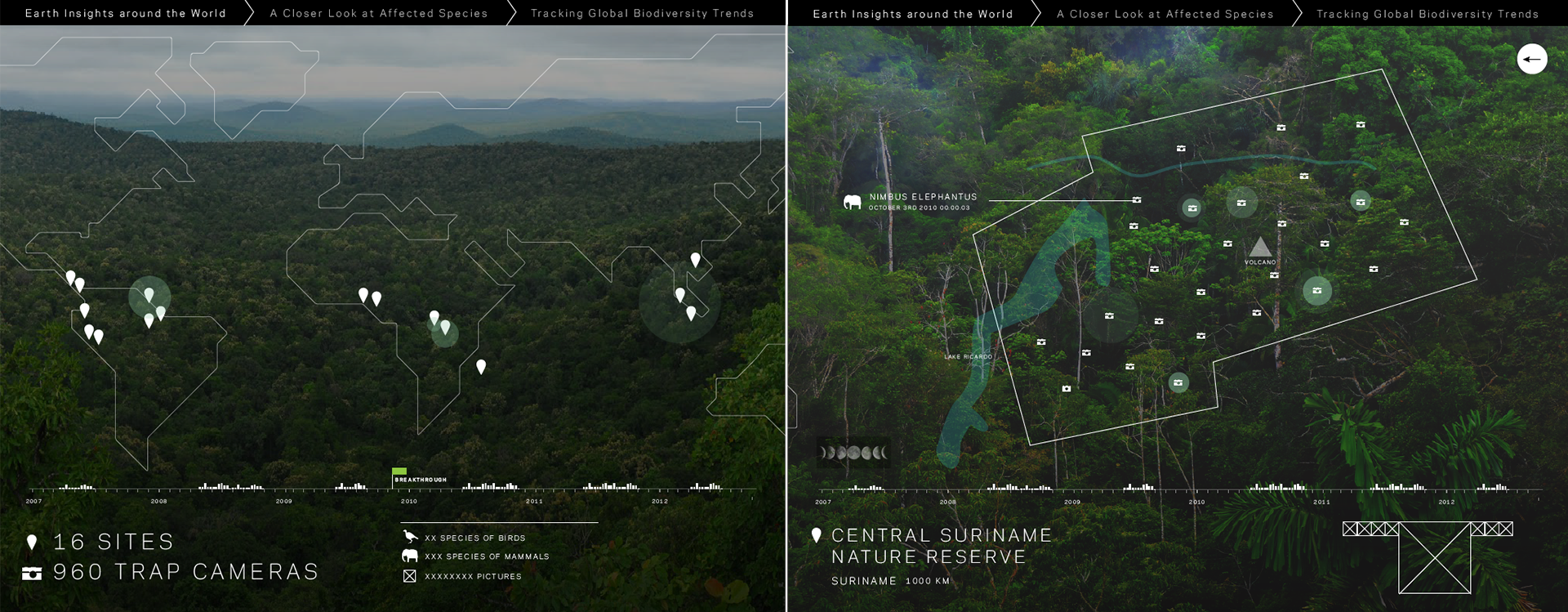
Display a timeline of events for trap cameras (capturing over a million images from around the world). View specific areas and a selection images that were recorded.
Display a timeline of events for trap cameras (capturing over a million images from around the world). View specific areas and a selection images that were recorded.
ENVIRONMENT 2
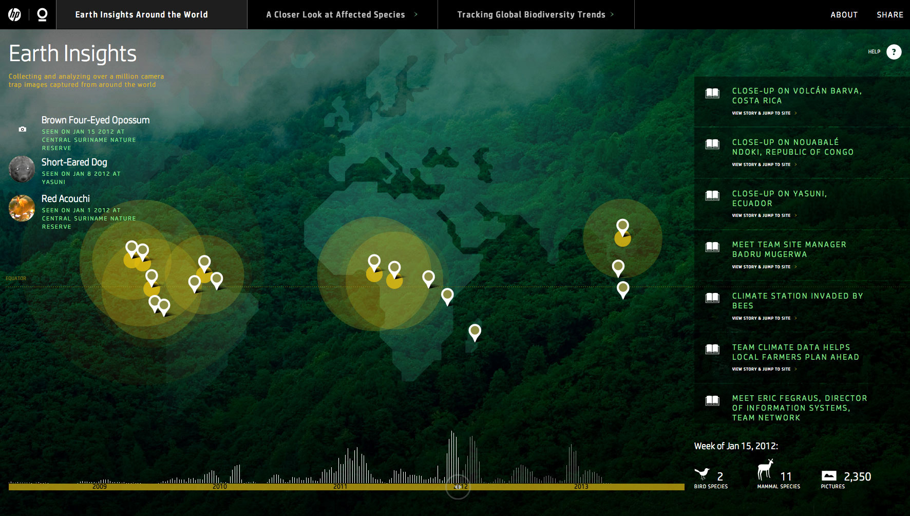
Demonstrate what the data is telling us about how climate, human activity, and land use affect species.
Demonstrate what the data is telling us about how climate, human activity, and land use affect species.
ENVIRONMENT 3
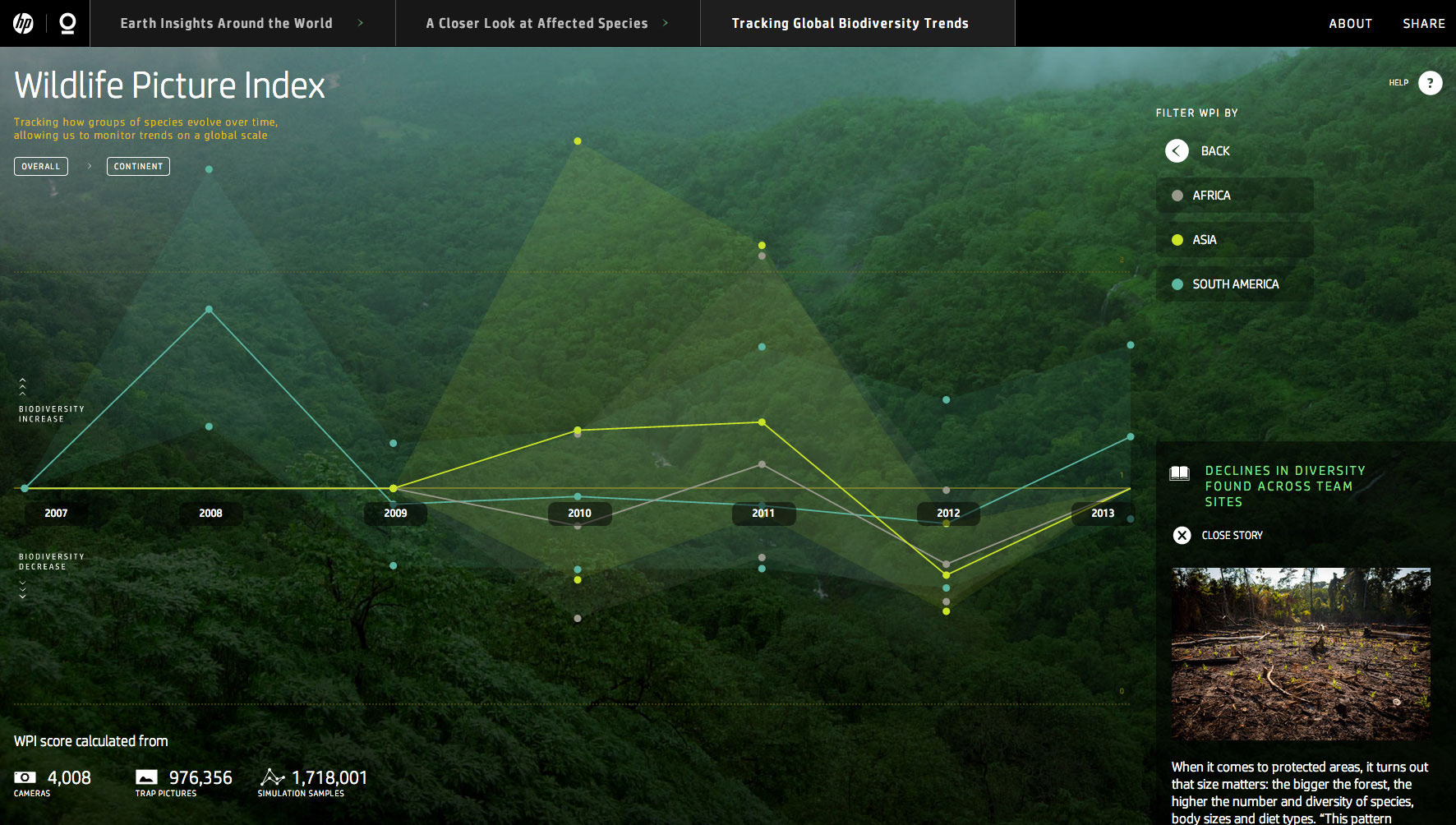
Track how groups of species evolve over time, allowing us to monitor trends on a global scale.
Track how groups of species evolve over time, allowing us to monitor trends on a global scale.
Moodboard & Preliminary Concept
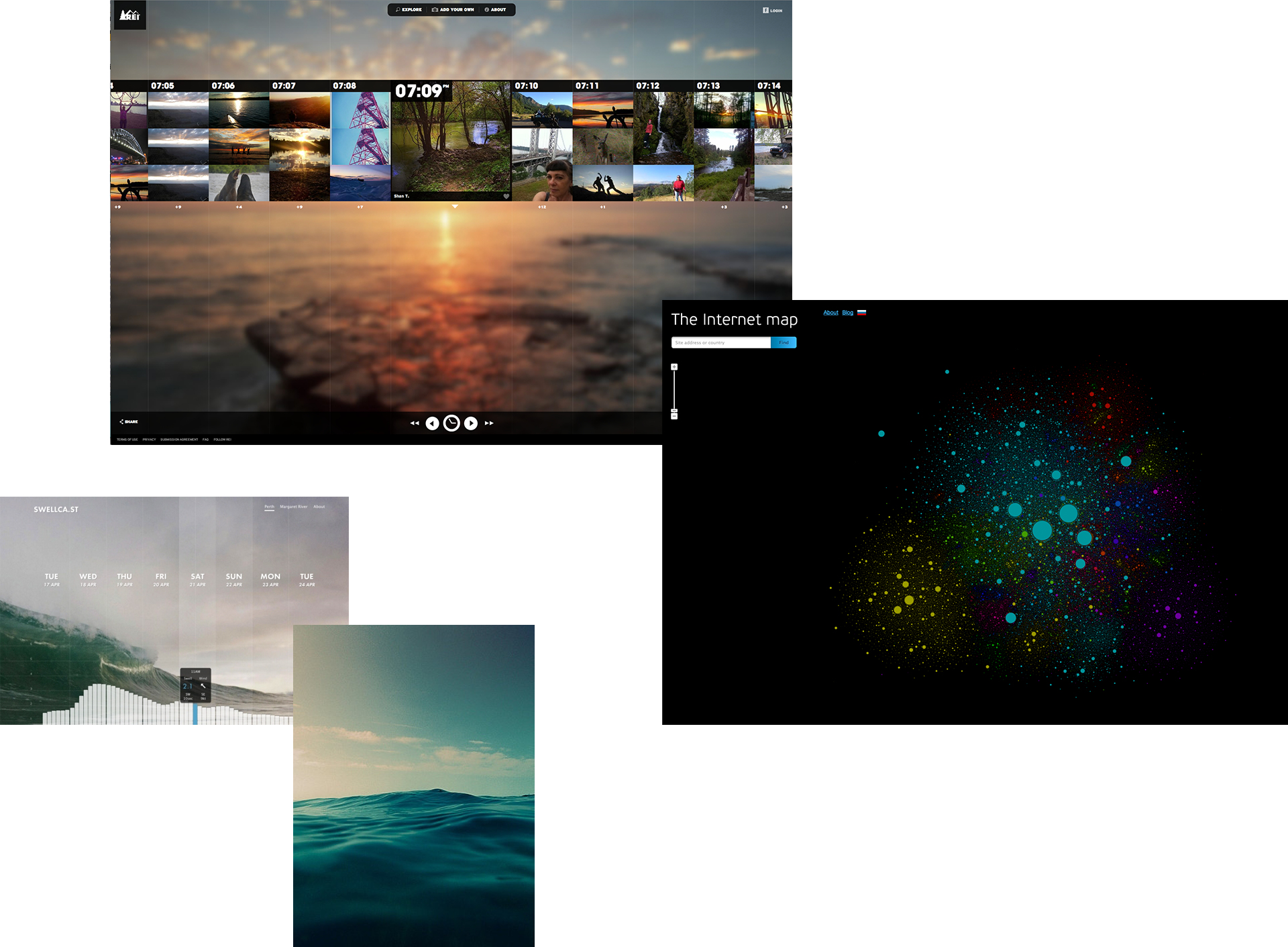
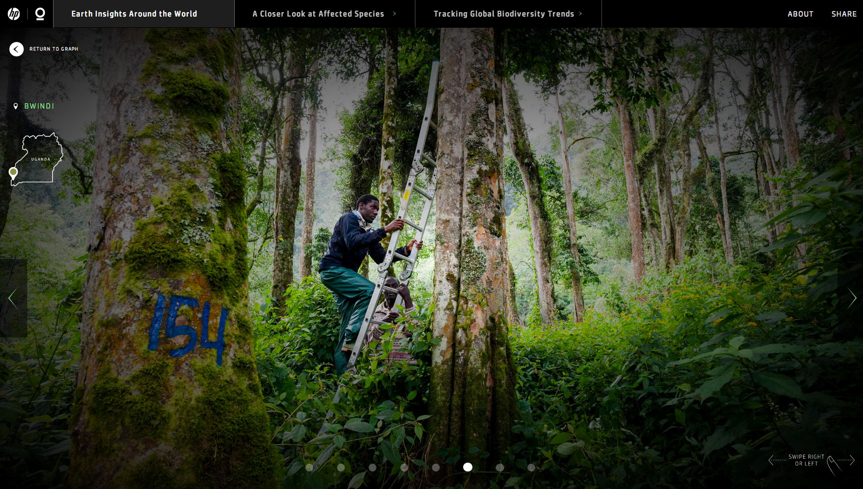
Data-rich visualizations were overlaid on lush forest photography to create an intriguing nature-meets-technology ambience.

Data, Timing with CI Experts
The timing of the project presented a unique challenge as design decisions had to be made while the data was still being analyzed by the CI scientific team. We eventually consolidated our findings by relying on regular communication between all project teams.
UI
Overlaying UI and data elements over beautiful photography presented an ongoing challenge. The worry was that the user’s attention would be overly distracted by the photography, to the detriment of the graphical information. In order to address this issue, we ended up searching for photography that melded into a monochromatic color scheme. This decision enabled us to assign a secondary colour scheme that could be applied for content and interactive elements. The tradeoff was that we had to exclude certain beautiful photographs. It was comparable to choosing the performance of one harmonious choir over that of a group of incongruent solo singers.
Typography
The screens that were selected poorly displayed smaller typography. To address this issue, a compromise was made on the amount of information displayed at once and the size of the type. The font family was set respecting the HP brand guidelines.


“This is an awe-inspiring, seductive and immersive display of quantitative information that expertly treads the line between gratuitous technological flash and accountable and decodable data. It’s a triumph of interaction and experience design.” —Christopher Simmons / AIGA Juror
Designed for in a 16:9 aspect ratio, the experience was presented at HP Discover Barcelona in 2014. Following the installation, we were invited to present the project at Visualized 2014 in New York.
AIGA JUSTIFIED 2014 / WINNER 2014
GRAFIKA 2015 / 100 BEST PROJECTS 2015
CLIENT
Hewlett Packard
Hewlett Packard
DESIGN BY
FFunction
FFunction