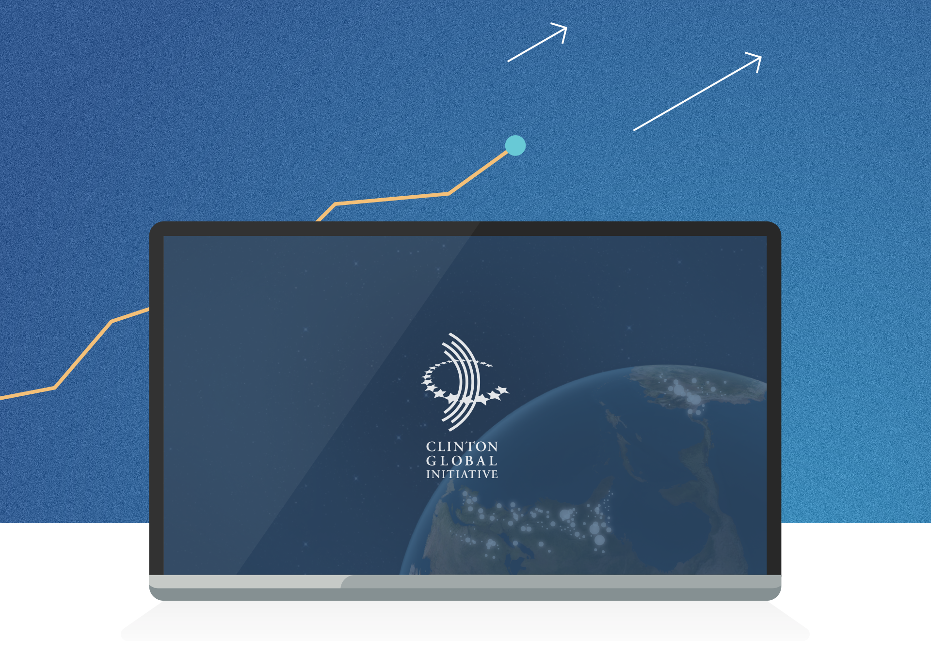
In collaboration with MKG, we were tasked to help bring nearly 3,000 of Clinton Global Initiative's humanitarian efforts to life for diverse platforms, including a comprehensive website and an interactive touch screen installation.
We worked closely with CGI to make an easy-to-navigate platform that allowed users to explore the stories underlying 10 years’ worth of data.
As the Art Director for this project, I was tasked to collaborate with a team of specialized professionals from the United States*. To ensure the success fo the project, we organized regular video-conference calls. I also made numerous trips to New York for prototype demonstrations and intensive weekend workshops. Needless to say, it was an interesting challenge to balance this brief with other agency projects. I had the opportunity to work with an amazing team. They were able to develop my design intentions by presenting adequate compromises that were overall more effective in the long run.
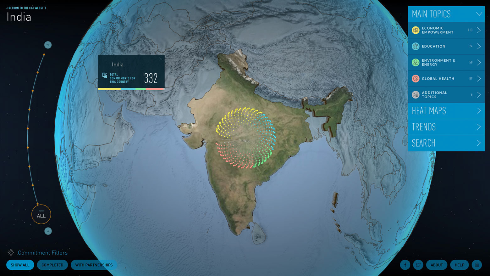
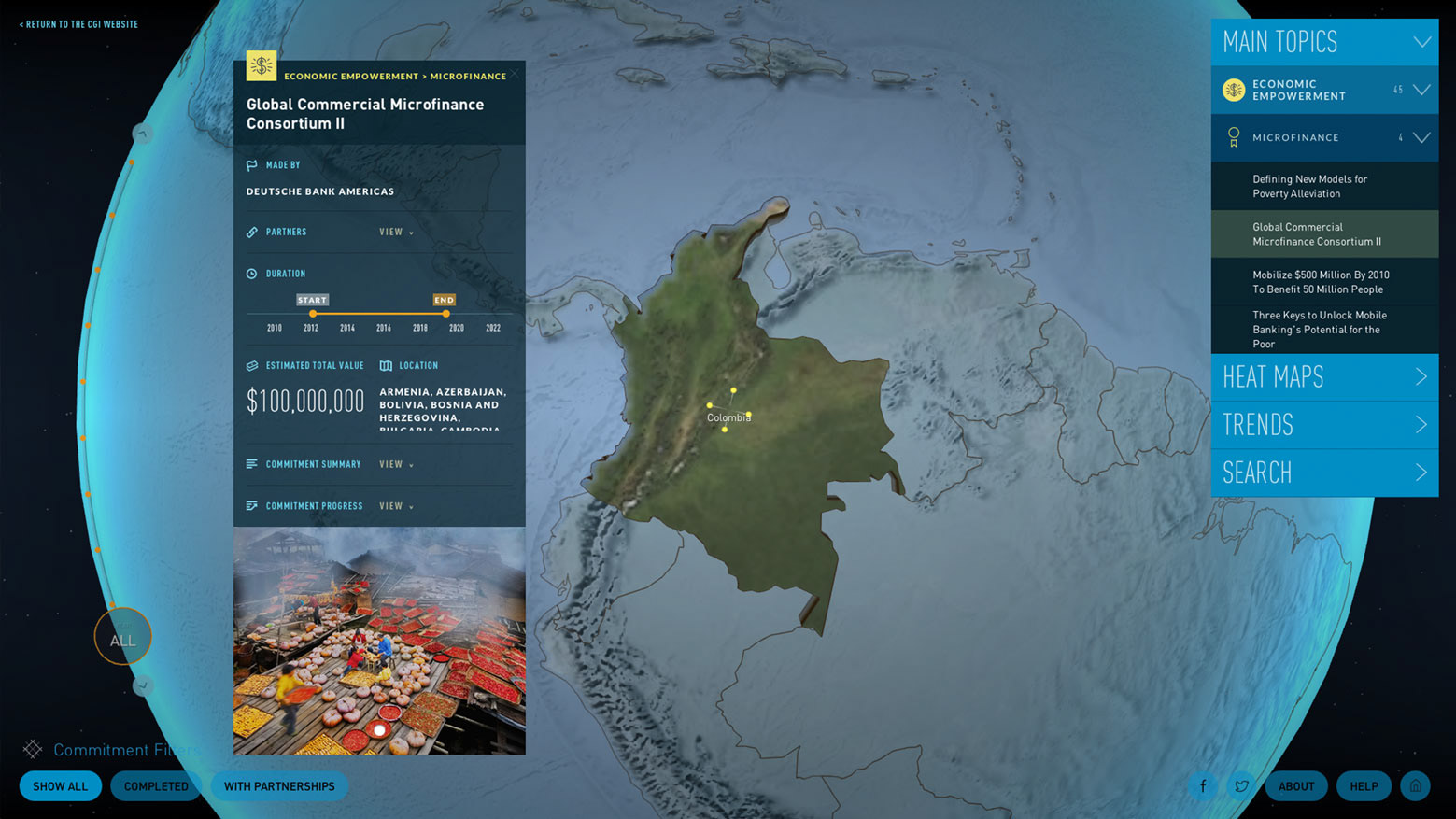
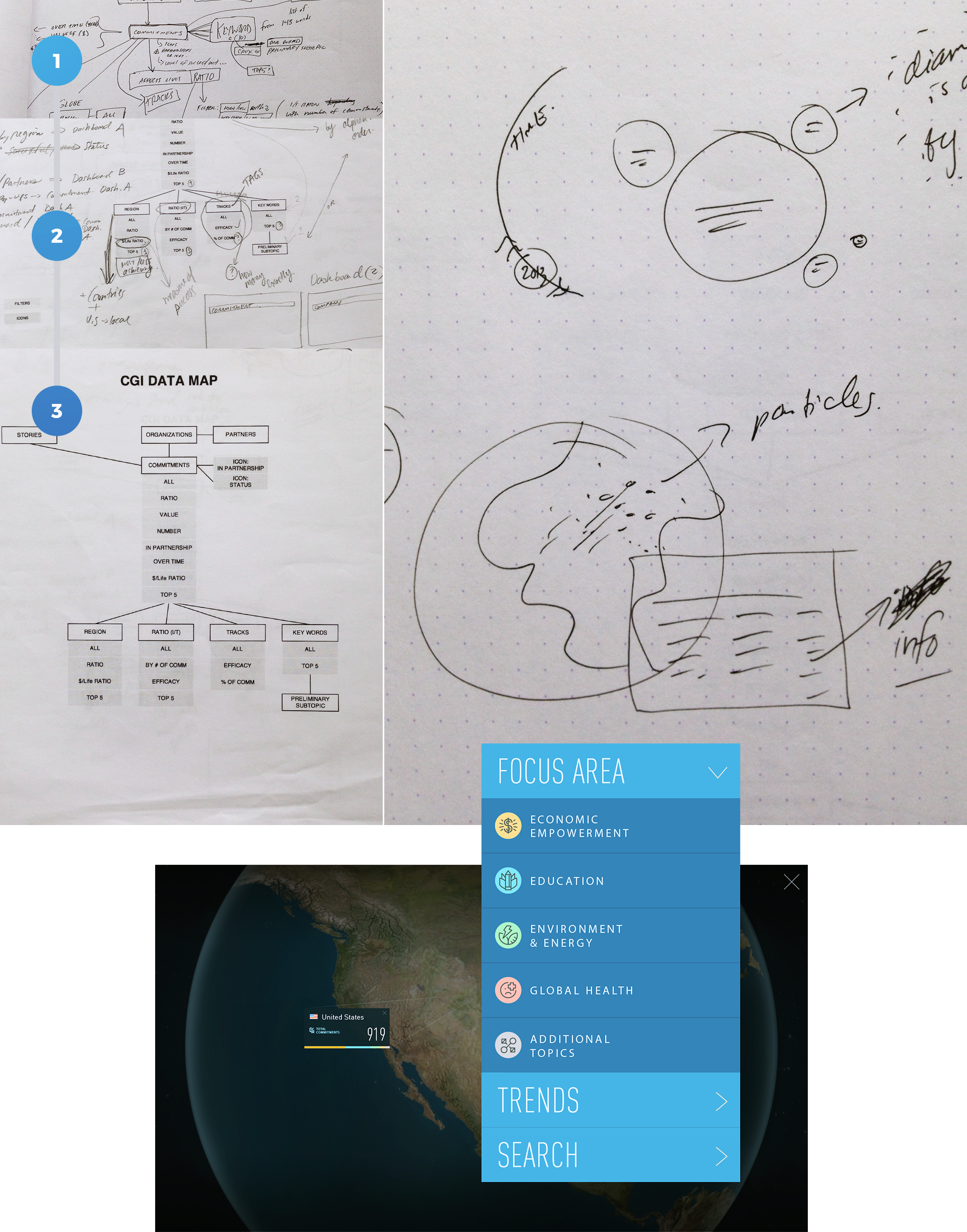
The idea of building a globe to visualize initiatives taking place around the world came naturally to us. It was also an interesting WebGL task for Lars, Globe Architect, to take on. After a few video calls and a few rough sketches we proceeded to the most important part of this brief: the data. The data we received was comprehensive, if disorganized. Slava, the Front and Back End Developer, and I spent many back and forths reducing the data to a manageable size for standard web browsers.
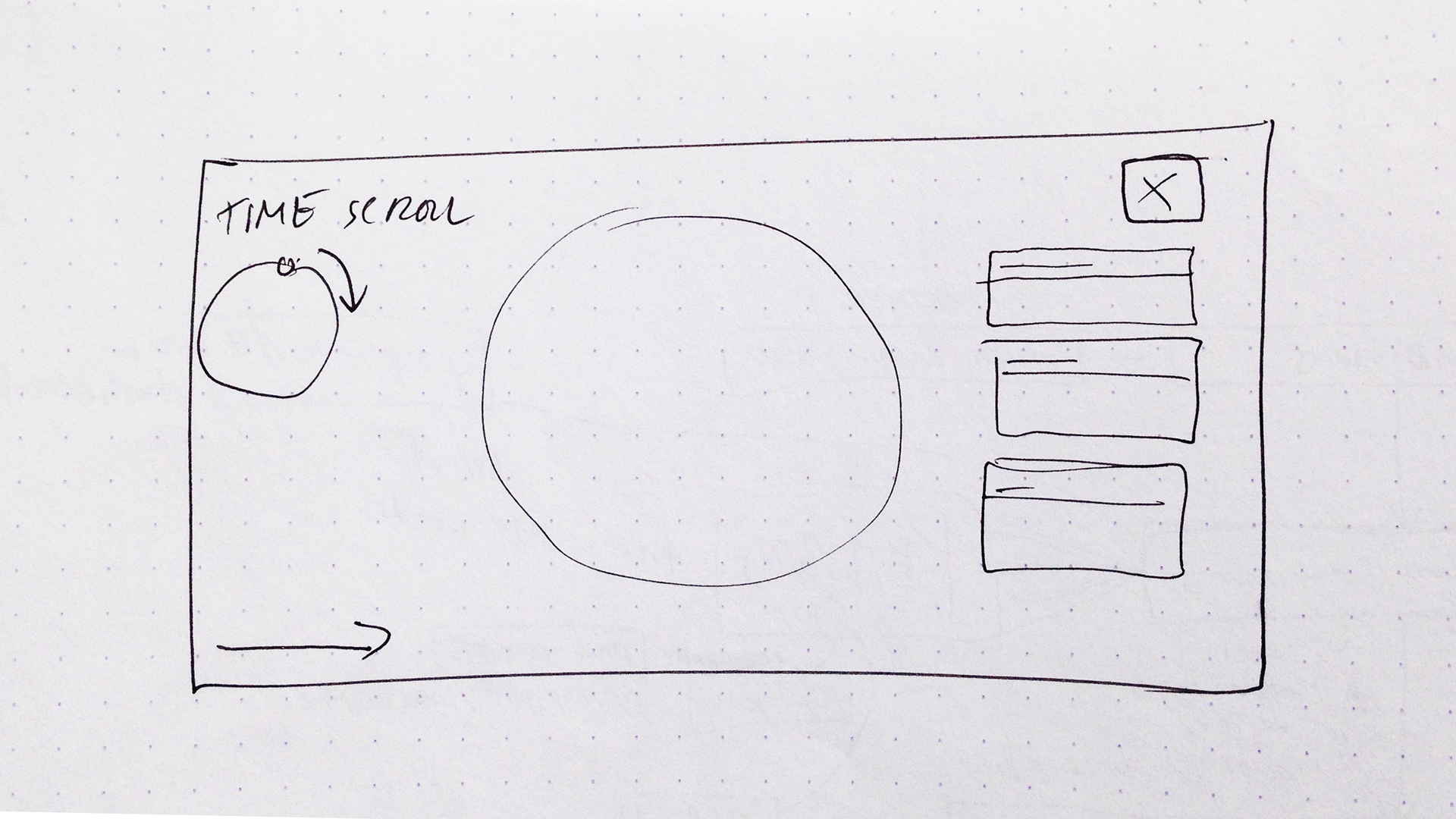
Meanwhile, the globe architect needed to start testing 3D globes and requested quick visual references from my side. After many globe iterations we finally keyed a concept. We then proceeded to build a graphical user interface to help visitors access the key points of the data.
Client Needs
•Show a summary of contributors by country selected (both visually and by text).
•Show a summary of data per commitment in a specific country.
•Have a menu to access the data by specific types: topics, trends, heat maps or by search.
•Be able to see the data evolve through time.
•Shareability
Design Issue
The vision of the project was how to process the vast amount of available data into interesting and informative data visualizations that highlighted the successes of the CGI. Indeed, after many prototype iterations, we were informed that only a certain number of data strings could be used in the overall experience. This hindered our ability to draw out qualitative informative for the audience.
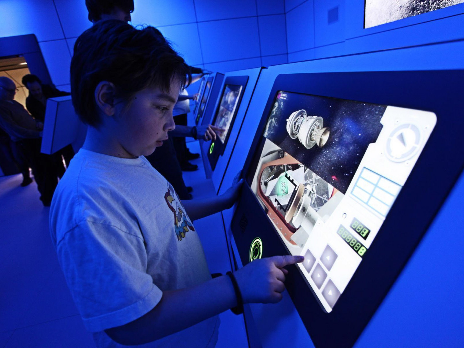
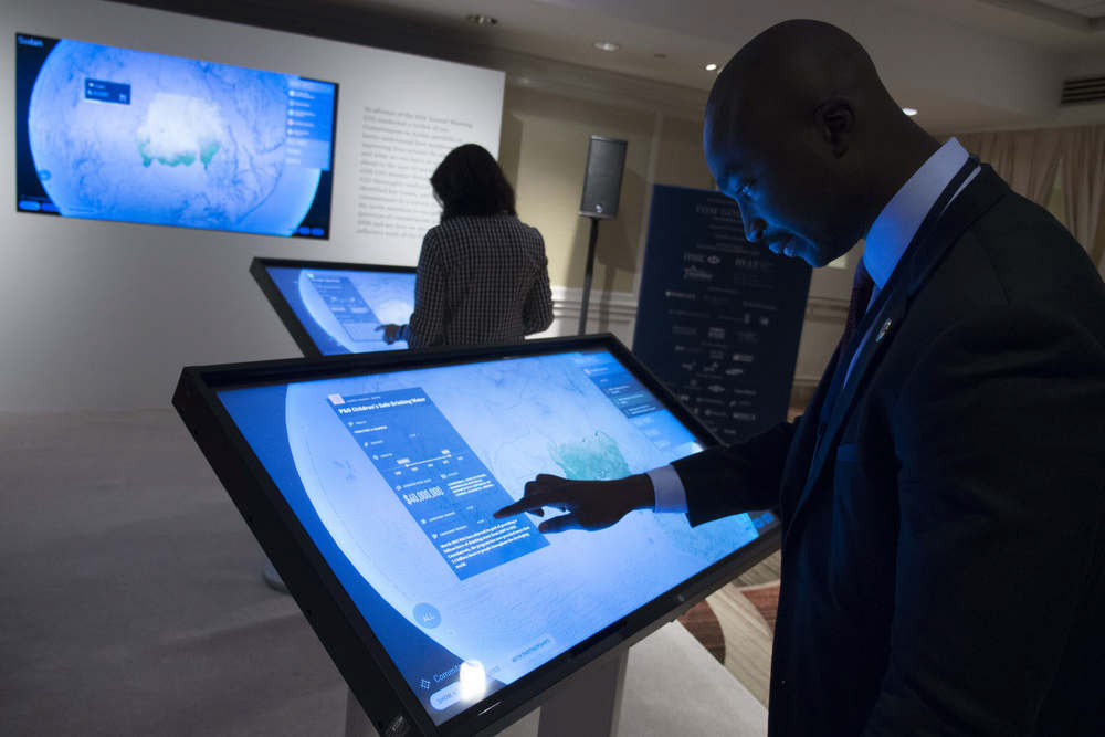
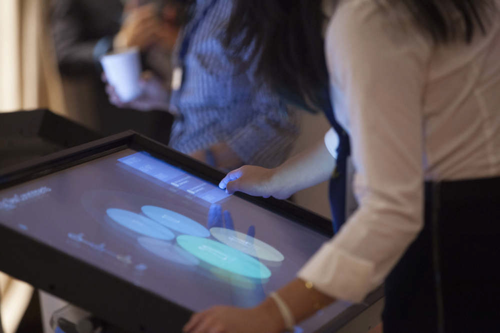
The Installation
The visual experience was designed for a multitude of platforms at optimal 16:9 aspect ratio. The project was presented at the Clinton Global Initiative Conference for 2014 as a multi-screen installation. Moreover, the installation also contained a video presenting highlights of the data as narrated by Chelsea Clinton. Finally, the experience was also available online.
CLIENT
Clinton Global Initiative
Clinton Global Initiative
AGENCY
MKG
MKG
ART DIRECTION, DESIGN & DATA VISUALIZATION BY
Dpt.
Dpt.
DEVELOPMENT
4REAL
4REAL
Google Chrome Experiment (November 2014)
Launch Interactive (Opens in a new tab)