Rules
•The experience should be 60 seconds long.
•It should inspire us to see the world we live in differently.
•One interactive concept should be used.
•It should employ a full browser design with common NFB/ARTE header.
•No navigation menu should be used.
•It must include sound.
•It should be understandable and accessible to an international audience.
•Project creators must own or have released all rights.
•It must be computer and tablet friendly.
•It must break one of the creative rules.
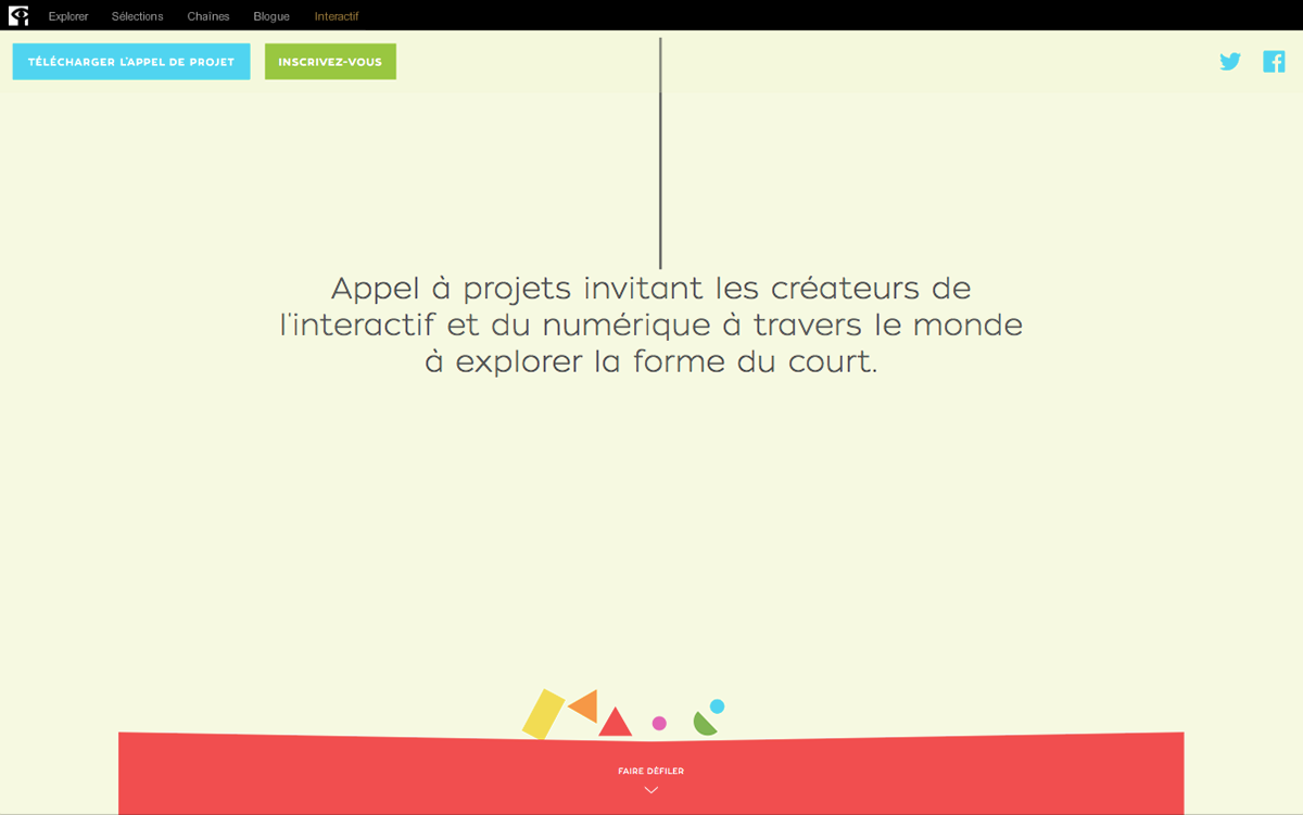
The goals set for this brief:
•Create an enticing brand identity for the project that would compel digital creators to submit a piece.
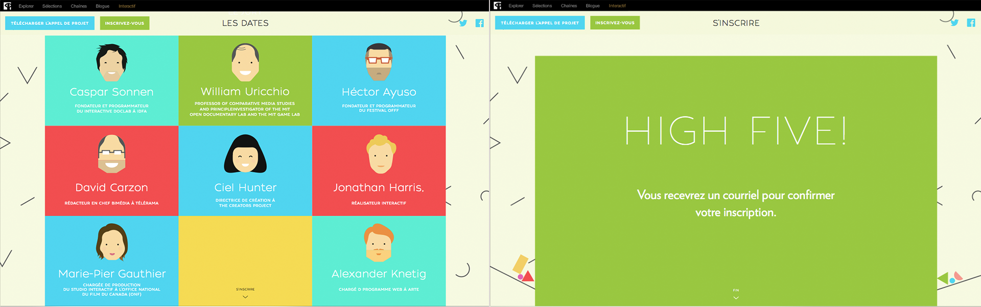
•Launch a submission portal that expressed the quirkiness of the project and presented information relevant to the project: guidelines, jury members and important dates.
•Once the 12 Interactive Haiku were selected, the submission portal needed to be updated to an exhibit page.
•Produce a short video teaser about the 12 projects to come.
Issues we needed to address for the exhibit page:
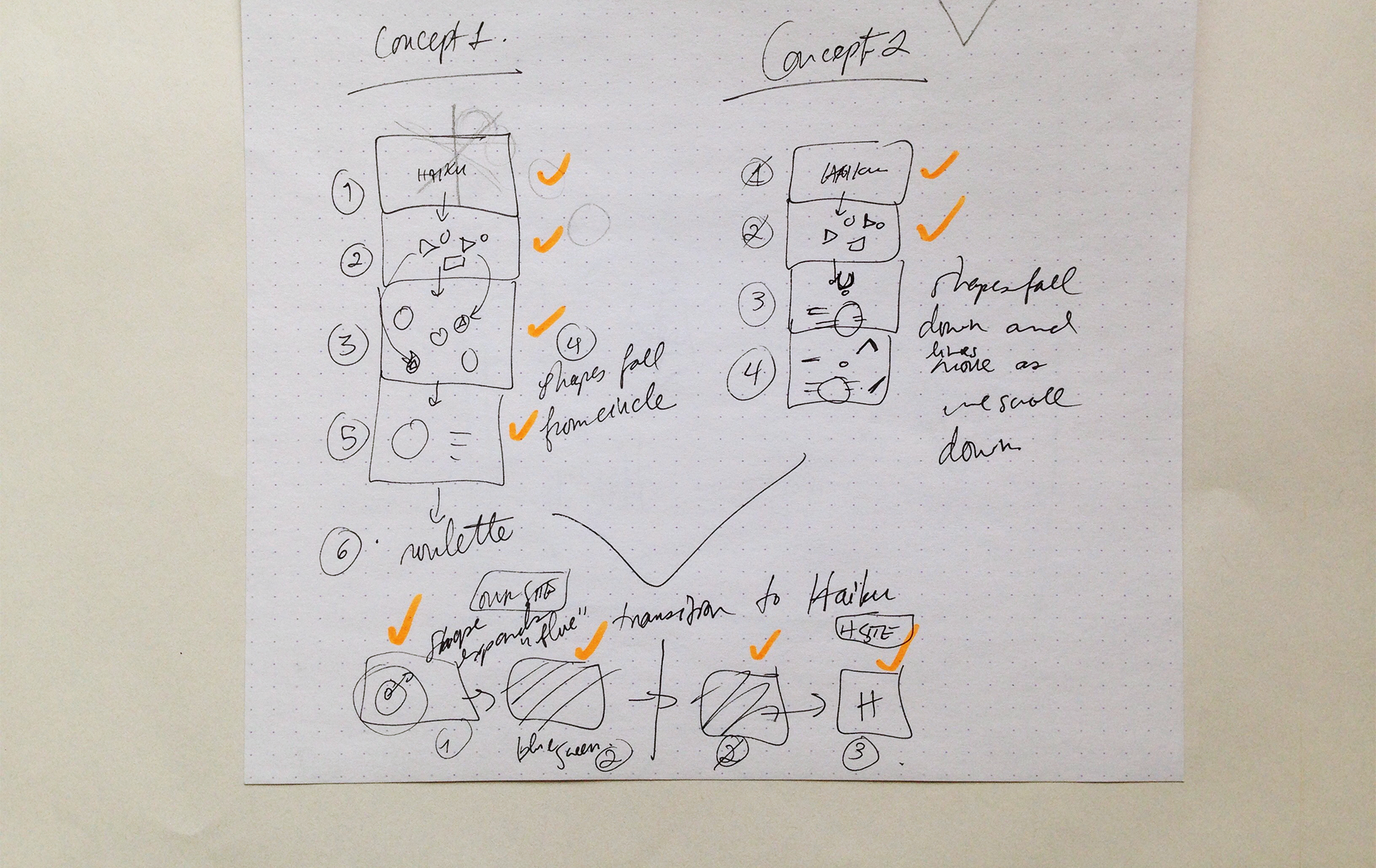
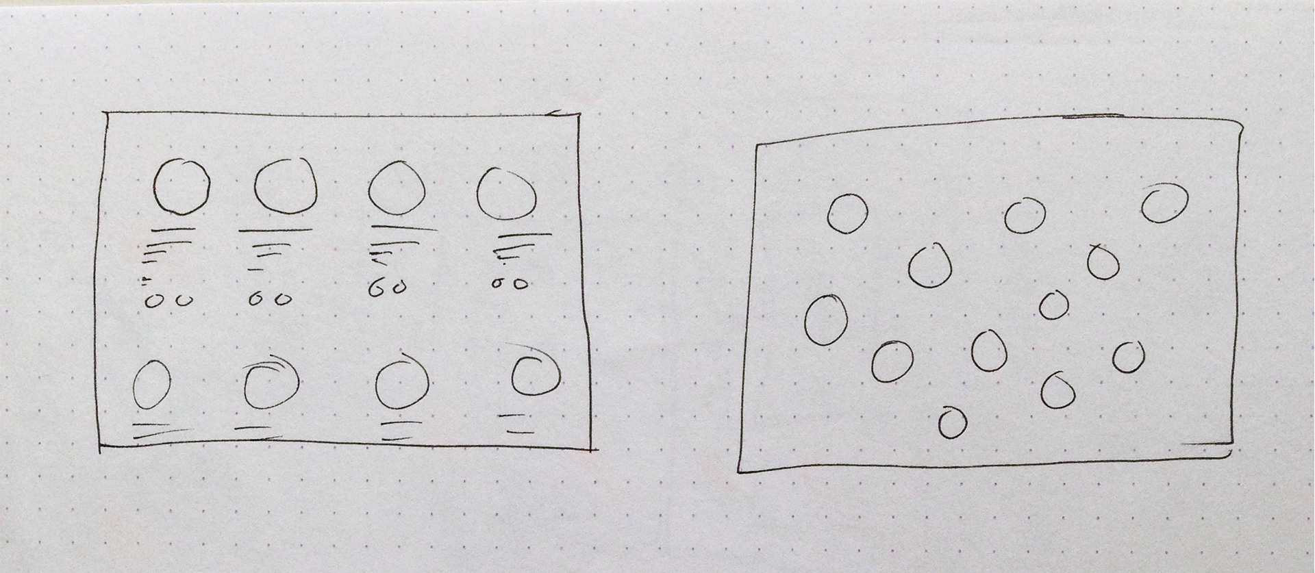
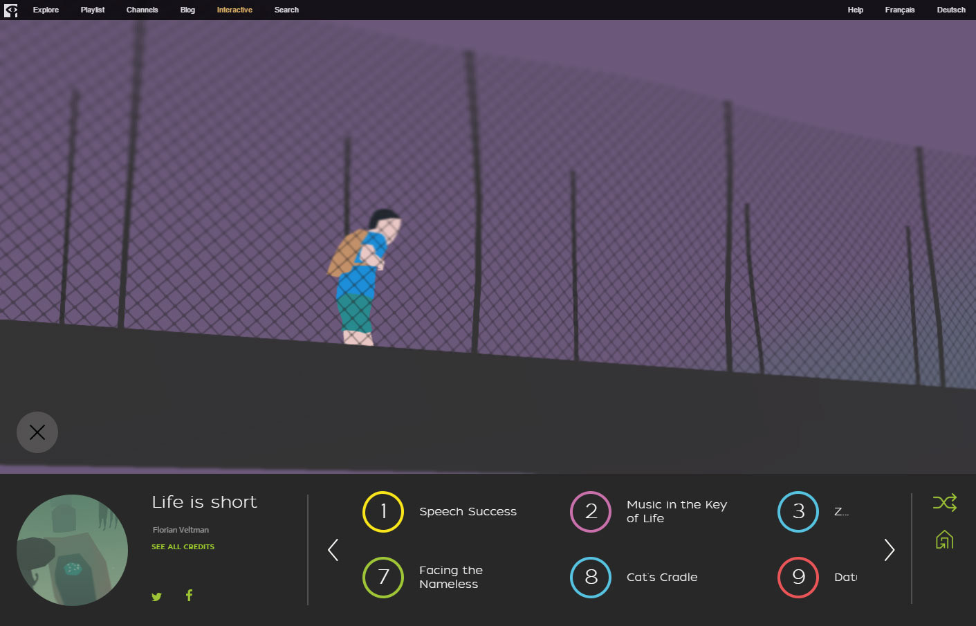
•A visitor needed to be presented with the most recently published Interactive Haiku, but was also presented with the previously published creations. As the website was built as a single page infinite scroll, the order of appearance of the following projects was randomized to diminish favouritism and to encourage visitors to explore all the Interactive Haiku.
•Each creation was to be hosted on the artist’s server, so we needed to create transitions that gave the impression that you were always in the same project environment.
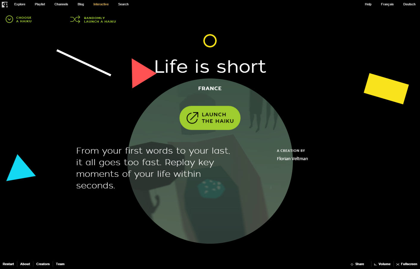
•Launch buttons needed to be clear and information pertaining to the experience (preferred platform) needed to be displayed.
In collaboration with Mathieu, my colleague and fellow Art Director, we built a brand that was colourful and playful, with a particular focus on the playful part.
The logo itself is meant to be airy and reminiscent of sketched lines whereas the shapes in between the lines express the product of creation: adorable and lively polygons.
All good for a static object, but how to incorporate playfulness in a website? All I could think of was Jell-O! I wanted objects to bounce around like Jell-O flung from your arms, with all your might, in the air. Of course Guillaume, our Front-End Developer, was less amused when he first heard of the task at hand. This resulted in many back and forths with him experimenting different physics models trying to achieve perfect Jell-O wobbliness.
It was a lot of work for such a simple effect, but it made all the difference in the site.
As submissions came in and the jurors selected 12 Interactive Haiku. We needed to quickly update the website as an exhibit page promoting the creations.
I thought to myself, why don’t soft objects become hard and vice-versa. I was wrong.
Jell-O effects were great for the big rectangles, but in the end, the average computer had trouble computing several wobbly objects bouncing around their screen colliding on fixed objects. We dropped the Jell-O parameters and kept them bouncing as solids.
162 submissions from 20 nations
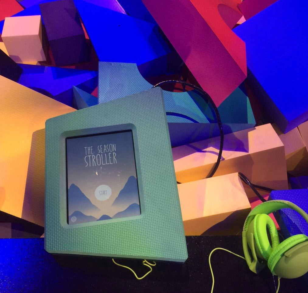
The family of Interactive Haiku were finally brought to the Tribeca Film Festival 2015 as physical installation. A pool of geometric foam pieces hosted visitors as they discovered hidden iPads (in sturdier foam) containing each an Interactive Haiku.
Overall, it ended up generating pleasant feedback from the public. The in situ platform offered a playground to exploration. Stripping away the timid human condition and let curiosity and creativity flow freely.
FWA of the Day / July 28th 2015
PRODUCED BY
the NFB and Arte
the NFB and Arte
CONCEPT, DESIGN & DEVELOPMENT BY
Dpt.
Dpt.
ENGINEERING & CONSTRUCTION BY
Dix au Carré
Dix au Carré
Launch Website (Opens in a new tab)