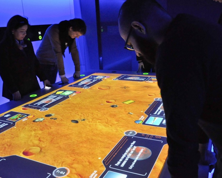
The usual client brief at FFunction unfolds in a two step process: 1) reception of unorganized data and 2) production of interesting data visualizations (static or interactive). This time, we needed to produce potential scenarios (visuals and associative data) depending on the audience input.
The following scenario needed to be followed:
•Identify yourself
•Answer a series of Q&A sections
•Receive a statement
•Pledge to take action
•Encourage sharing to promote awareness within your friends and family
•Answer a series of Q&A sections
•Receive a statement
•Pledge to take action
•Encourage sharing to promote awareness within your friends and family
Overall, it was like asking people to take a survey so they can understand what cancer would “off” them. Cancer is a delicate subject and usually these surveys aren’t presented in the most captivating ways.
•Keep your audience’s attention by creating short interaction with rich visuals and animations.
•Ensure a comprehensible, coherent and intuitive design. Each part of the experience was subtly colour coded, illustrations were constant throughout the survey and interactive elements were easy to find (taking in consideration accessibility issues for certain visitors to the site).
•Ensure that the ratio between textual and visual information was balanced.
One of the obstacles we faced during the development of this project was building a set of visuals and friendly interface from an organization that talks about sensitive subject, but also has a restricted brand guidelines. I built an extension of visuals that was harmonious with the client’s identity:
•Working hard so the committee behind the project were unanimous
•Creating illustrations that provoke empathy even though the subject matter is tough to consider for certain people.
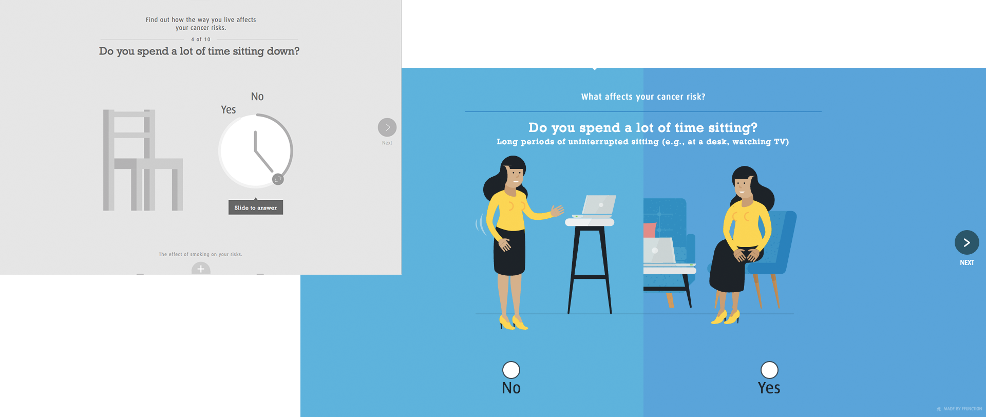
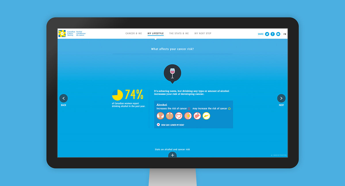
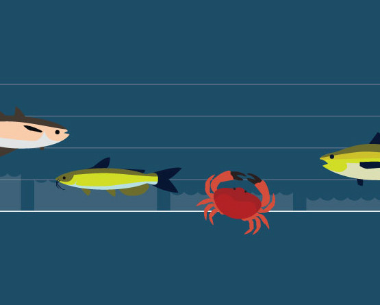
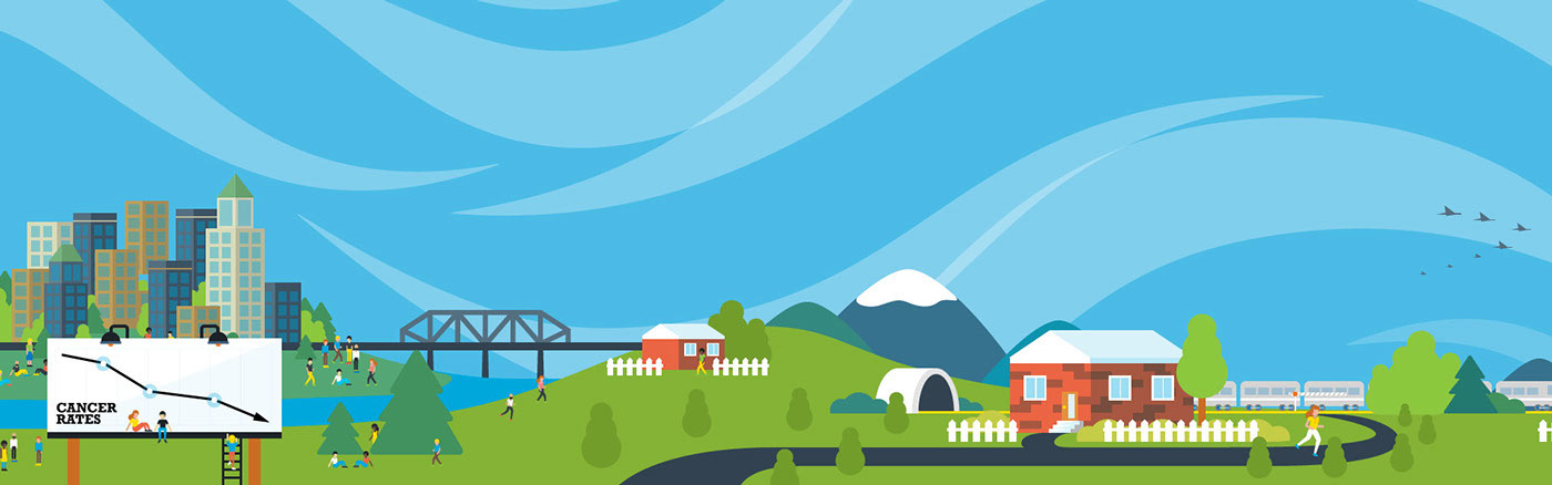
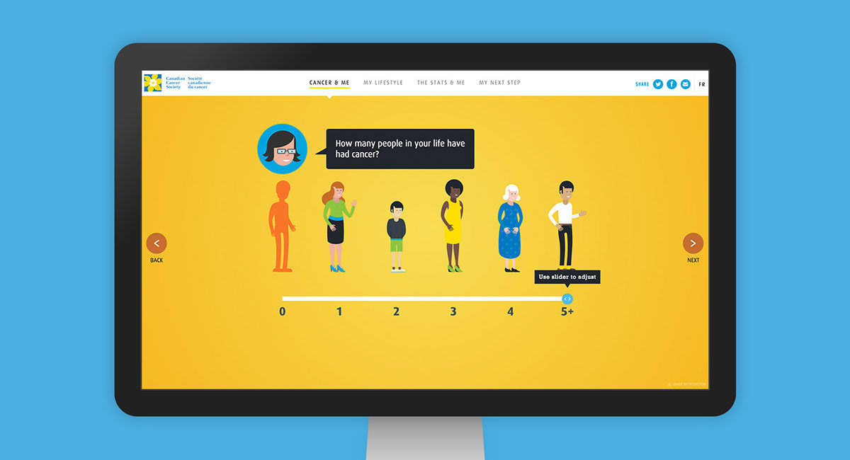
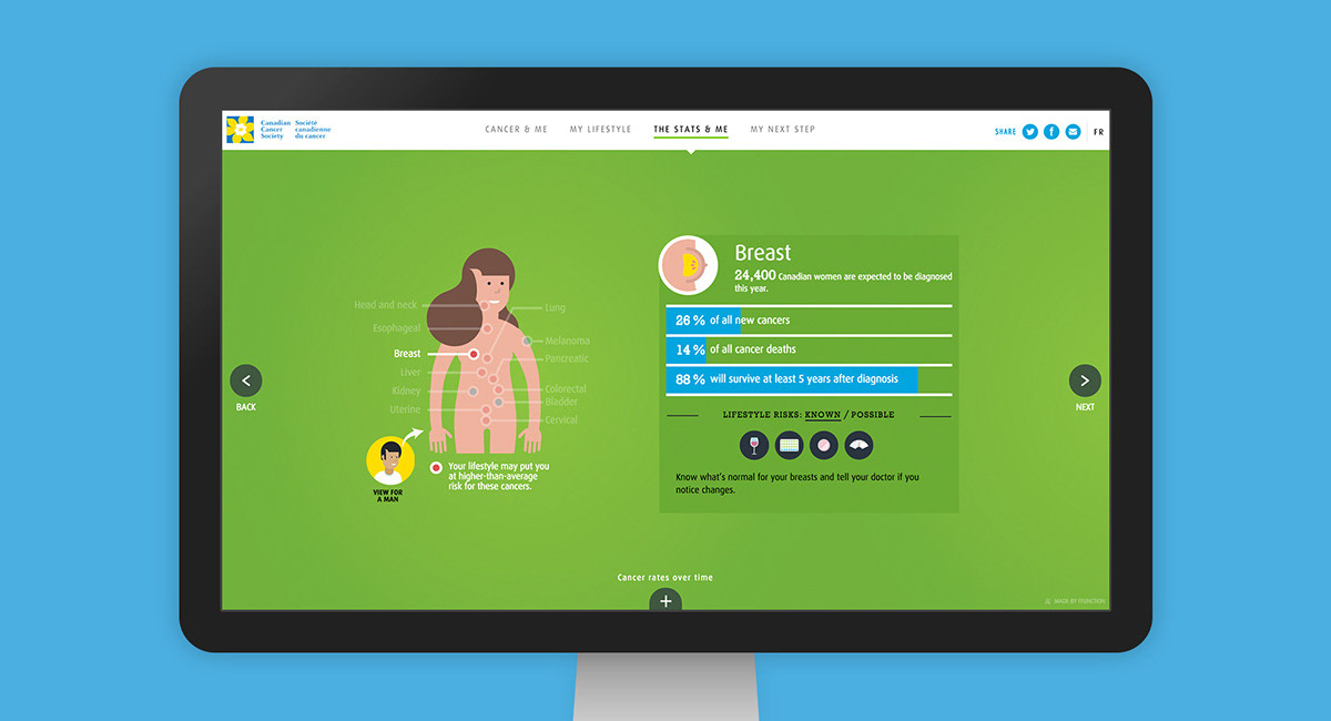
Presented in four main steps, the application begins by allowing users to predict their probability of getting cancer during their lives. Users are then invited to determine their lifestyle and daily actions, ("Do you smoke? What's on your plate? Do you spend a lot of time sitting down?") while visualizing the potential health consequences. At the end of the experience, users are invited to explore general statistics on cancer, as well as its evolution over time in Canada. Last but not least, personalized resolutions, recommendations and advice are offered to users based on their previous answers.
The interactive tool can also be used by educators and health organizations to raise awareness about cancer prevention.
The web analytics for the period September 10 - February 10 2015 are compelling. "It’s My Life" received 20,618 unique visitors, and 28,540 visits. Users spent 4.11 minutes on the site and collectively made 5,422 pledges to change their behaviour. It received 567 shares on Facebook and 308 shares on Twitter, including retweets from high profile users such as Bif Naked (130,000 followers) and Andre Picard (30,100 followers).
•98% of users agreed that It’s My Life information is relevant.
•94% of users said that they learned a lot about how to reduce their cancer risk.
•84.3% intended to explore cancer.ca for further information
•And the most impressive: 92.7% of users intend to make a lifestyle change to reduce their cancer risk.
An integral part of this project is the follow up; timely reminders from Canadian Cancer Society via social media such as “Have you been standing up more often this past week?” which aim to turn good intentions into tangible results that will save lives.
INTERNATIONAL DESIGN AWARDS (IDA) 2015 SILVER / INTERACTIVE MEDIA 2015
REDGEES 2015 BEST IN REGION / QUÉBEC 2015
NUMIX 2015 / FINALIST 2015
SO(CIAL) GOOD DESIGN AWARDS NON-PROFIT / CLIENT INITIATED PROJECTS 2015